Bitbns - Homepage Redesign
A clearer, more trustworthy entry point into crypto investing.
Category
VD, UI, Illustration, IA
Duration
4 months
Year
2020
Bitbns - Homepage Redesign
A clearer, more trustworthy entry point into crypto investing.
Category
VD, UI, Illustration, IA
Duration
4 months
Year
2020

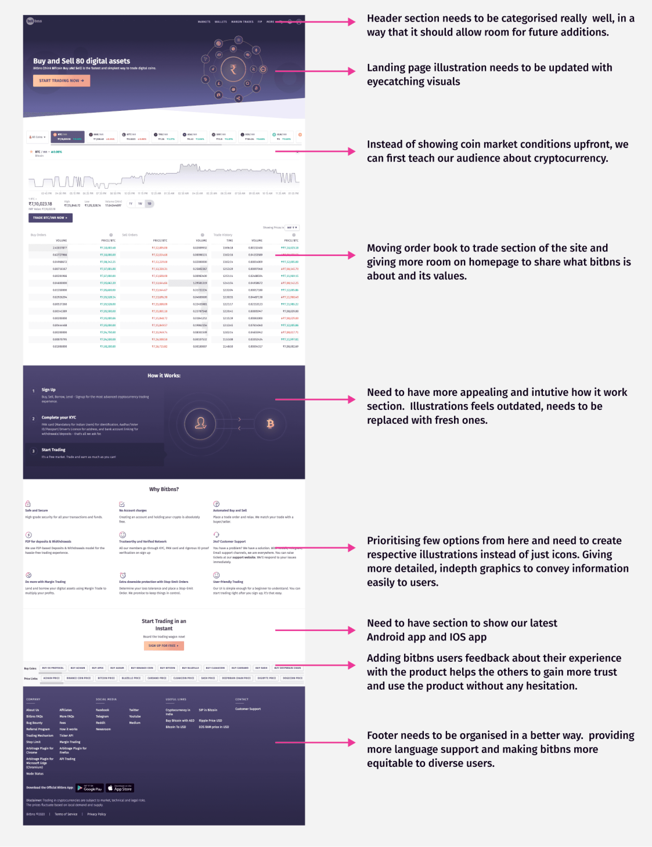
Opportunity
The old homepage suffered from dense content, unclear hierarchy, and weak trust signals — especially for beginners trying to make their first investment.
We set out to build an experience that:
Communicates trust instantly
Reduces cognitive load
Helps beginners get oriented
Feels consistent across devices
Approach
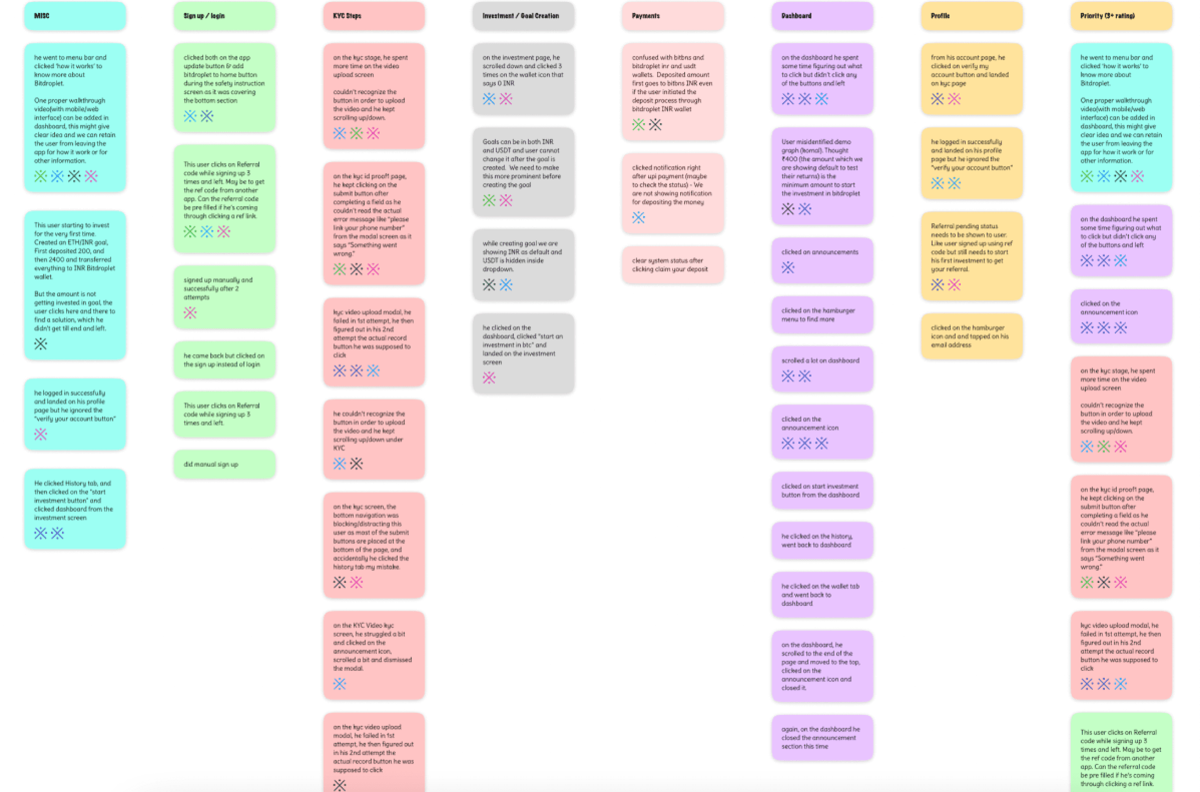
Research & Insights
Interviewed new and returning users
Conducted heuristic review + affinity mapping
Key issues emerged:
No clear starting point
Token table hard to scan
Lack of brand confidence & trust cues
Design Priorities
Create a simpler, more guided onboarding entry
Strengthen hierarchy using cleaner layouts & spacing
Rebuild the token table for clarity
Introduce multilingual support
Refresh the visual tone with custom illustrations
Execution
Rapid sketches → low-fi → high-fi
Weekly reviews with CEO/CTO
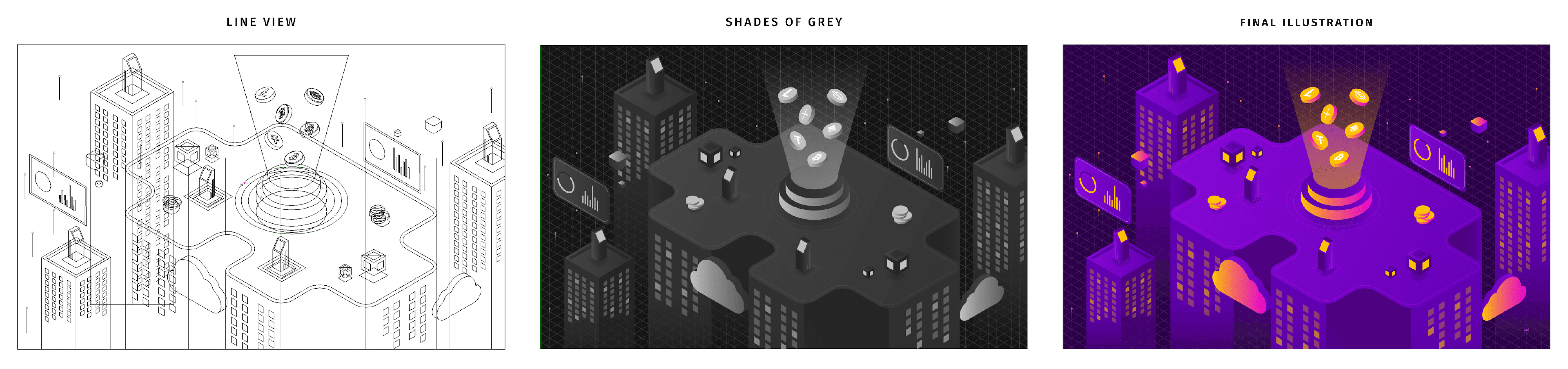
Custom isometric hero illustration
Responsive layouts for desktop → tablet → mobile
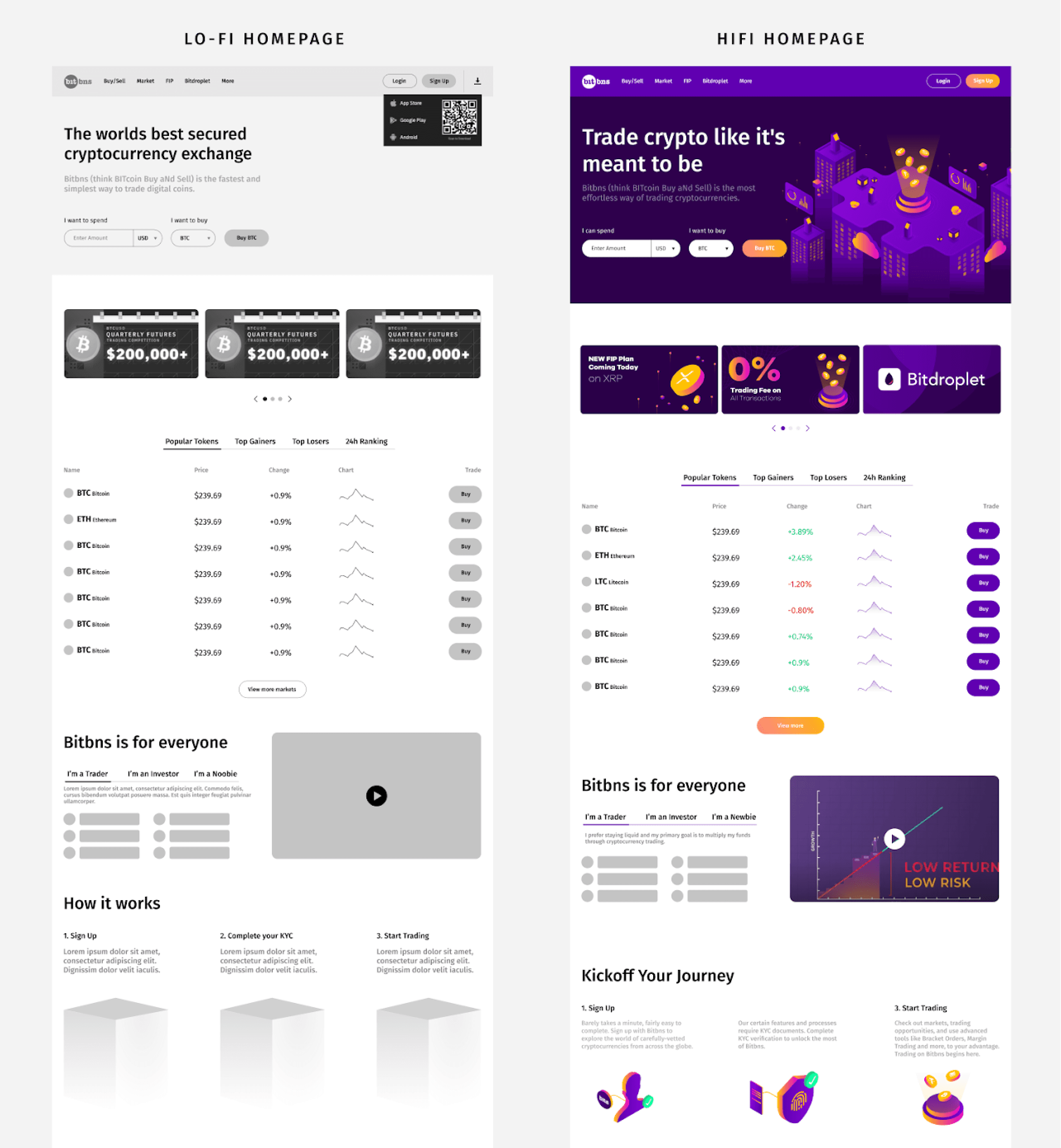
Key Improvements
Clearer onboarding: fewer fields, better context
Higher trust: testimonials, structure, confident tone
Better readability: improved table hierarchy + breathing space
Stronger brand personality: custom illustrations
More inclusive: multilingual support
Final Designs
A clear, cohesive interface that balances simplicity for beginners and depth for traders.
Outcome
The redesign made Bitbns feel more accessible and credible — especially for first-time crypto users — while preserving depth for seasoned traders. Feedback from stakeholders highlighted improved brand cohesion and clearer user flow. Qualitative user feedback suggested better comprehension and ease of use.
Reflection & Next Steps
This project reaffirmed a core belief: when designing for complexity, clarity and trust are your most powerful interface tools. Going forward, I see opportunities for: dark mode, persona-based homepages, and more interactive onboarding experiences.
Enter Password
Hint: Coutdown begins